Creating Accessible Buttons
Sun Apr 10 2022

On almost every web page there are buttons. It is hard not to encounter one on a daily basis as a web developer. Unfortunately, it is easy to produce an inaccessible button if one is unaware of what needs to be implemented. Buttons, like anything else we create on the web, should follow WCAG guidelines and consider best usability practices.
We will learn about button functionality and styling by creating one from scratch.
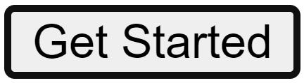
It will be a "Get Started" button, which will trigger a popup modal and ask the user for their information in a form. A button like this is on Medium's home page. Let's think about how to start implementing it.
Semantic HTML
The first thing to consider is how to represent a button in the markup. There is the button <button> element, but there is also the link/anchor <a> element. Choosing which element to use can sometimes be confusing.
Links generally navigate the user to some other place on the web. That means either somewhere else on current page, or to another web site. The anchor element has a href attribute that accepts a URL, unlike the button element.
Buttons generally trigger something to happen on the page, like a popup modal, navigation menu, or some kind of content shift. Buttons can also natively submit or reset form content. Here are some important aspects of each to consider:
Links:
- focusable by default with
hrefattribute - has
:link,:visited,:focus,:hover,:activestates - the Enter key registers as a click
Buttons:
- focusable by default
- has
:focus,:hover,:active,:disabledstates - the Space key registers as a click
The importance in knowing these elements' native functionality is that if you want to create a button or a link that does not use semantic HTML (it is a <div> or a <span>, for example), then it is the developer's job to recreate this functionality with CSS, JavaScript, and/or aria labels.
So what HTML element will we choose for our button? It can be tricky when we think of how to implement the modal. One way to implement a popup modal without the use of JavaScript is to link to a specific tag, say, #modal. Then, when the button is pressed, we style the #modal:target CSS property. Another way is to use the button element and use JavaScript to add/remove a class that shows the modal.
At this point, it is really up to the developer. As long as the button is usable and accessible, it can be created as a link, button, div, span, etc. It is often easier to use semantic HTML elements since they offer native functionality that we don't have to implement ourselves.
In our case, I will make our button an actual button HTML element.
<button class="button" type="button">Get Started</button>
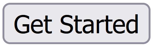
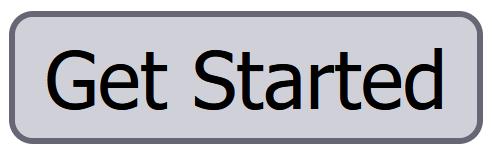
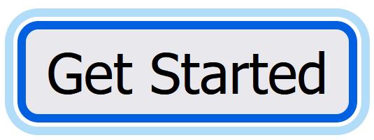
Without any styling, this button will show up differently depending on the browser.
Firefox button:
 Firefox button on hover:
 Firefox button on focus:
Chrome button:
 Chrome button on hover:
 Chrome button on focus:
Since these buttons show up so differently depending on the browser, it is usually necessary to reset these styles and add our own. This makes it so the button will look the same across all browsers.
To reset all button styles, we can apply these styles:
.button {
    border: none;
    background: transparent;
    padding: 0;
    cursor: pointer;
    font-family: inherit;
}
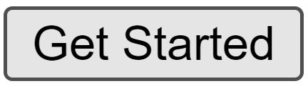
Now our button looks just like any other text on the page, giving no indication that it is a button other than the cursor change. It looks this way on any browser.
Now we can recreate our button with the styling we want for our page. A lot of it is under the developer's discretion, but there are some important points for accessibility that should be considered.
Color
Stephanie Eckles talks about proper button color contrast in her CSS Button Styling Guide. There are two pairs of colors to think about: the button background color to the background color it is displayed against, and the button text color to the button background color. Each has a color contrast ratio that should be adhered to.
- 3:1 --> button background color to background color
- 4:5:1 --> button text to button background color
Figuring out the contrast ratio of color combinations is not something you're supposed to calculate yourself. There are several apps that can do it for you. Here are some of them:
- Button Buddy: specifically a button contrast generator!
- Adobe Color Contrast Checker: displays the contrast ratio for any color combination
- WebAIM Contrast Checker: another reliable contrast checker
- WAVE (web accessibility evaluation tool): a browser extension that checks for accessible contrast ratios on the whole web page
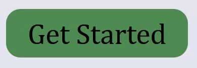
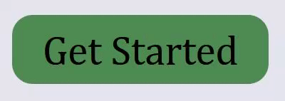
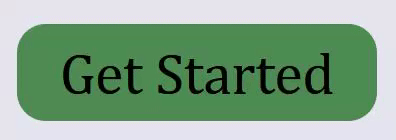
For our example, our website background will be an off-white color. Our button will be shades of green. I will use button buddy here to generate colors with high enough contrast.
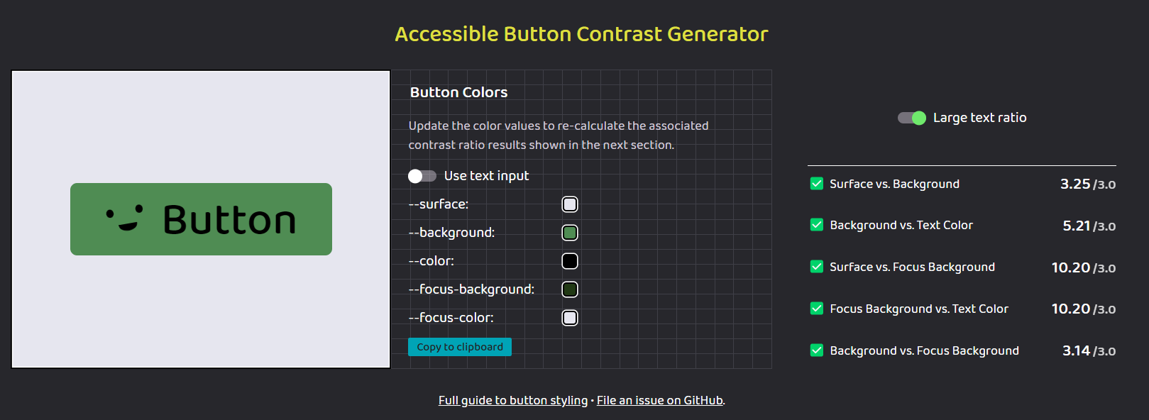
All contrast checks are passing! Now we can apply these colors to our button, knowing well that there is proper contrast between every state. By pressing the "copy to clipboard" button, we copy the color values we made attached to CSS custom properties that we can include in our project with ease.
:root {
    --surface: #e6e6ef;
    --background: #4f8c53;
    --color: #000000;
    --focus-background: #213914;
    --focus-color: #e6e6ef;
}

.button {
    border: none;
    background: var(--background);
    color: var(--color);
    padding: 0.25em 0.75em;
    cursor: pointer;
    font-family: inherit;
    font-size: inherit;
    border-radius: 0.5em;
}

.button:hover {
    background: var(--focus-background);
    color: var(--focus-color);
}
:hover
Since our colors are in order, now we can focus (...get it?) on the different button states. We've started to implement the :hover state since we have colors for it, but we might want to add a transition to make the color change less jarring. This can be done with one line of code.
.button {
    transition: 200ms all ease-in-out;
}
Putting this CSS declaration here will apply the transition to and from all button states!
:focus
For the button's :focus state, the browser adds an outline to the element. The last thing the developer should do is remove the outline and call it a day. We want to make sure that the focus state is clear and distinguishable for keyboard users. It does not have to be done with an outline - it can be done in other ways like underline, box-shadow, or border. In our case I'm going to use the box-shadow property but basically create an outline. The reason I'm doing this is because the animation will apply to box-shadow but not outline. Since a button can be in :hover and :focus state at the same time, I will make the outline color a darker green (almost black).
:root {
    --focus-border: #080e05;
}

.button:focus {
    outline: none;
    box-shadow: 0 0 0 3px var(--focus-border);
}
:active
The button's :active states comes into play as:
- a touchscreen user touches the button
- a mouse user clicks the button
- a keyboard user presses spacebar on a focused button
It is important to have a style on this pseudo class, but it doesn't have to be terribly different from other button states. In our instance, it is perfectly fine for it to have the same styles as our hover state. We can simply add the pseudo-class to the .button:hover selector.
.button:hover,
.button:active {
    background: var(--focus-background);
    color: var(--focus-color);
}
:disabled
The :disabled state of a button is somewhat complicated. For starters, I don't think it is a very common thing to want to disable a button. But, if a certain requirement needs to be satisfied before being able to use a button, then it is important to make that known to the user.
What I've gathered is that using the disabled attribute on a button can be made more accessible by instead using the aria-disabled='true' attribute.
The concern is that when a button is disabled through the disabled HTML attribute, the user cannot focus on the button. While that seems fine at first thought, it might leave the user frustrated as to why they cannot focus on it. There is nothing that lets the user know why it is not able to be focused. They might just think that your website is broken.
Rather, with the aria attribute, the button is focusable and semantically it is still a disabled button. In addition, however, the button is clickable with the aria attribute, so the developer needs to disable whatever happens on click when this aria attribute is applied. Also, the idea is that the developer will add a small tooltip of some sort to tell the user why the button is disabled. Overall, with this implementation, usability is much better.
Since our button does not need to be disabled, I will not include an implementation of it. If you want a more in-depth look into accessible disabled buttons, however, read the CSS-Tricks article called Making Disabled Buttons More Inclusive by Sandrina Pereira.
Conclusion
By following these steps, every button you create will be accessible. What I did not cover was how to make a functional and accessible button that is neither a link or button HTML element by using aria attributes. There is a very helpful article by Paul J. Adam on deque.com called Building Accessible Button with ARIA: A11y Support Series that goes in-depth on what aria attributes to use and when.
I hope this helps someone on their web development journey!
Photo by Katya Austin on Unsplash