Fluid Typography with CSS Clamp
Sun Feb 13 2022

The range of devices that have browser capabilities is large nowadays. We have smart phones, tablets, laptops, and desktops, to name a few. Their screen sizes range from very small to the size of television screens.
In order to make a website's typography accessible, the developer needs to accommodate for various screen sizes. Since the range of screen sizes is so large, we cannot expect that the same font size will work for all screens. For mobile phones the text will be too large, and for large monitors the text will be too small. Wouldn't it be nice if the typography on our webpage could get smaller or larger according to the screen size?
It would be nice. In fact, we can do something like it with a built in CSS function called clamp().
CSS clamp()
The clamp() function is especially convenient when it comes to controlling the size of the font according to the viewport size. To begin to understand what this function does, let us look at the three arguments it accepts.
- a minimum value
- a flexible value
- a maximum value
Here is an example of using the clamp function on a heading element.
h1 {
    font-size: clamp(16px, 5vw, 44px);
}
So how does it work?
Let's look at the arguments first. The minimum font size is set to 16px, which is ideal for readability (the font-size should never really be smaller than 16px). The maximum font size is set to 44px. The flexible value is 5vw.
If you are unfamiliar with the vw unit, it stands for viewport width. 5vw means 5% of the viewport width. Like rem, em, and ch, for example, vw is a relative unit. This means it's size changes depending on something else. For vw, it is completely dependent on the viewport. For rem and em, it depends on either the root or element's font-size. For ch, it depends on the width of the 0 character. Units like px, pt, mm are absolute, meaning they don't change depending on anything. They are a fixed size.
In the clamp function, if a fixed size unit is used as the flexible value, it will not work. In that case, the font-size will always be equal to that value (as long as it is in-between the max and min values), and it will not be responsive at all. So, make sure that relative units are used as the second argument.
What the clamp function does in this case is make the font-size 5% of the viewport width, only if that size is within 16px and 44px. If it is outside of that range, then the font-size will be either the min or max value depending. This makes it so the h1 element's font-size will always be somewhere in-between 16px and 44px, and it will smoothly transition between the two. This is what it looks like as I change the viewport size.
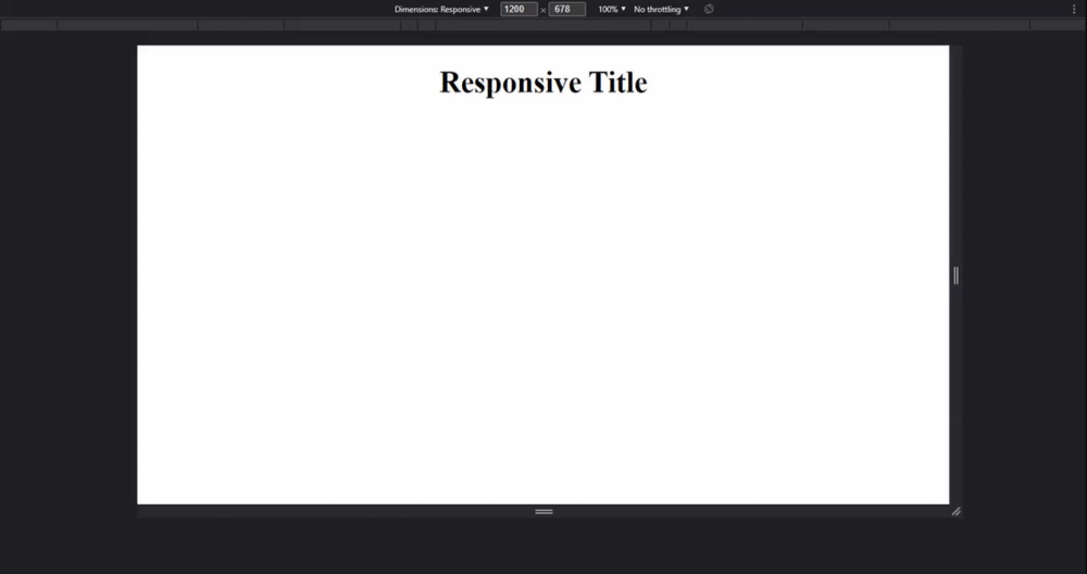
The font-size starts at 44px since 5% of the viewport width is larger than 44px. Then, as the viewport gets smaller and 5% of the viewport width starts to be less than 44px, the font-size gradually gets smaller and smaller. Finally, when the viewport gets small enough that 5% of the viewport width is less than 16px, the font-size locks at 16px.
Underneath the surface, the clamp() function uses CSS min() and max() functions. If you are not familiar with them, you can learn about them on MDN. This is what our clamp function is rewritten as max() and min() functions:
h1 {
    font-size: max(16px, min(5vw, 44px));
}
While it isn't terribly hard to understand after looking at it for a little bit, the clamp function has better readability for the developer.
In addition to using the clamp() function on font-size, it can be used with other properties like width, padding, and margins. Technically, "the clamp() function can be used anywhere a length, frequency, angle, time, percentage, number, or integer is allowed" (MDN).
Browser Compatibility
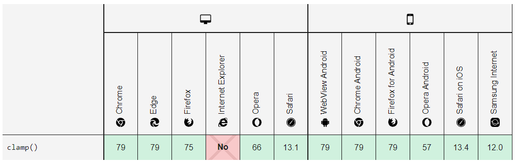
Luckily, the CSS clamp() function works on most browsers. It doesn't work on Internet Explorer, but that is to be expected. Microsoft dropped Internet Explorer in 2015 and by 2022, it will finally be retired. According to caniuse, the CSS clamp() function has a 92.35% browser compatibility, which is exceptional. This makes it so developers can easily create fluid typography for their webpage. There is no need for several media queries and a longer CSS file! It can be done in a single line.
Overall, the clamp() function is a very convenient CSS function to instantly add responsiveness to typography on a webpage. It is esential for the user to be able to read text at any screen size, and this function ensures that is possible. Yay for fluid typography!
image attribution: Photo by Markus Spiske on Unsplash