Tackling the Theme Toggle
Sun Feb 27 2022

Tackling the Theme Toggle
It is very typical nowadays to see a dark mode option on websites. A lot of people prefer the dark aesthetic, or prefer it for accessibility reasons. Even operating systems have incorporated a dark mode option that the user can set, and it'll make their user interface dark or light. Setting the color theme at the operating system level usually translates to the browser as well as websites. I say usually because some websites may not take advantage of this feature.
@media (prefers-color-scheme: <light/dark>)
There is a CSS media query called prefers-color-scheme that can access the user's color-scheme preference. The user can either prefer light or dark mode. There used to be a third option as well called no-preference, but it is deprecated now because browsers never implemented this third option.
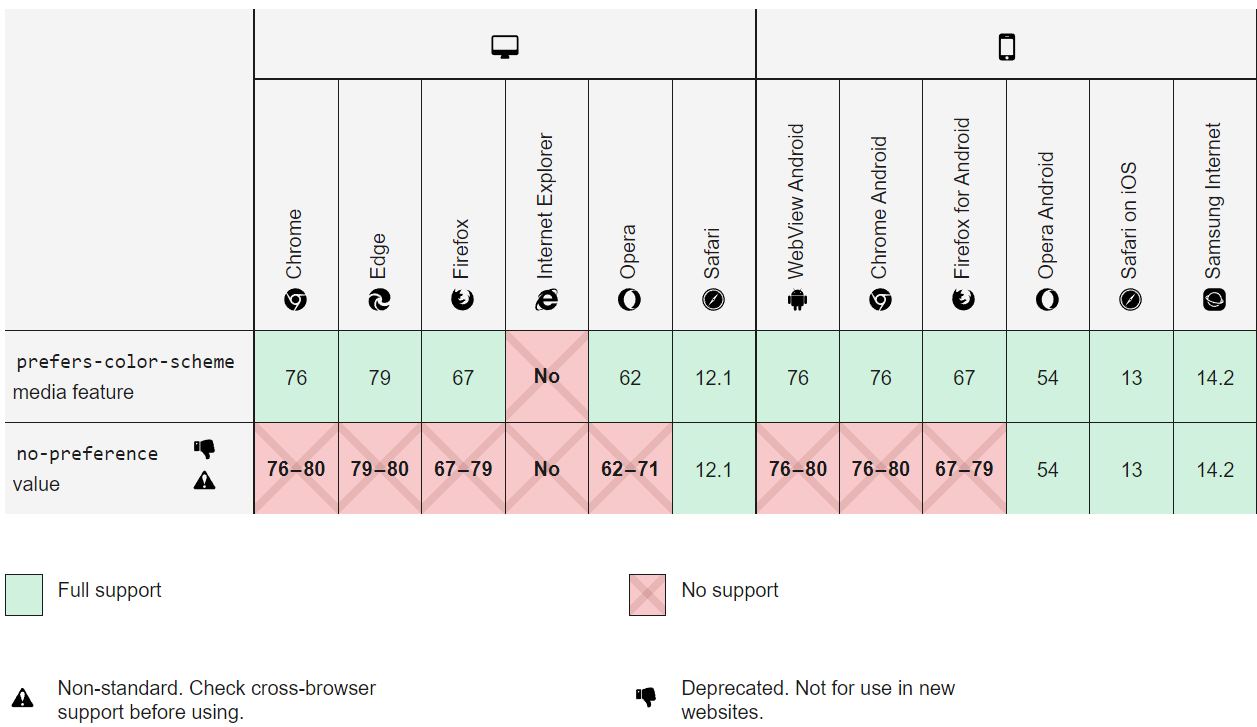
Every browser except Internet Explorer supports this media query, so it is a convenient and effective way to access the user's color scheme preference. This chart shows the decreasing support for the no-preference value as well.
With this media query, the developer can control what styles to apply according to the color preference. Since it is only ever light or dark, we only really need to include one prefers-color-scheme media query in our whole project. Yes, I'm serious!
Implementation Plan
Now that we understand the power and convenience of the prefers-color-scheme media query, it is time to decide how to use it. There are a couple options for how to implement our light vs. dark color schemes.
- Have the website display dark/light mode according to the user's system preference.
- In addition to 1, include a button that toggles dark/light mode in case the user wants to stray from their preference. Use local storage to remember preference on reload.
Both of these options seem great. I've seen both of these implementations a lot. But lets talk about some of the pitfalls of these implementations.
The first option is probably the simplest to do, but the user doesn't have the flexibility to change the theme if they want. They are tied to their system preference. Who knows if the user might like your website's light mode more than its dark mode? I want to give the user more freedom and give them a button.
The second option seems like the best option. When the user opens the webpage, the color scheme will be whatever they set as their system preference. The user can also toggle the theme if they want, and whatever it is set to, their browser will remember it the next time they open the website. Unfortunately, this is where a small problem lies.
Think this through with me: Imagine a user goes to a website and their system preference is dark mode. For whatever reason, the user flips the theme to light mode and continues browsing. Later on in the day, the user comes back to the website and is blinded by the light mode. They expected it to be dark, since that is their system preference. After that very first time the user toggled to light mode, their choice is forever stored in local storage. After that point, the user's system preference does not matter. The user is unable to go back to letting their system control the color scheme.
While we thought we were accommodating the user with local storage remembering their choice, it might end up not being what the user really wants. For this reason, we can use this third implementation option.
- Give the user 3 options to choose from: light, dark, and system.
By giving the user 3 options to choose from, they can decide whether to default to their system preference or override their preference by choosing a theme. Local storage can be used and it won't be hurtful to the user. If they want to resort back to their system preference, they can just choose the system option. This third option is especially convenient if the user has their system change to dark mode at night, for example. The website will change when the system preference changes according to the time of day.
Applying Styles
Now we must think about the best way to include the dark color scheme in the stylesheet. There are some options, and I don't think one is necessarily better than the others. It is really up to the developer to decide. The CSS Tricks article by Adhuham called A Complete Guide to Dark Mode on the Web goes in-depth for each option.
My favorite method and the one I will talk about here is a light, dark, or system class that will apply to the body element. Each class has CSS Custom Properties that define specific colors for that theme. The same variables are defined in each class with different values attached to them. That makes it so all the variables used elsewhere in the stylesheet will swap values depending on what class is attached to the body element. All of the colors are defined in one place, which makes it extremely convenient and organized, and playing around with different colors cannot be easier!
What this looks like
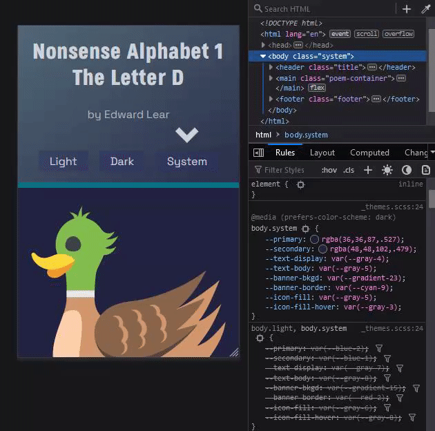
Here is an example of what this looks like. I recently included a theme toggle on a website and used this strategy of implementation. First, I defined some custom properties on the body element with a light class.
body.light {
    --primary: blue;
    --secondary: green;
}
For brevity sake, I'm only including two custom properties. There can be as many as you need. Then, I redefine those custom properties on the body element with a dark class attached to it.
body.dark {
    --primary: darkblue;
    --secondary: darkgreen;
}
Then, we define what happens when we attach the system class. Remember, we want the website to reflect the user's system preference with the prefers-color-scheme media query.
body.system {
    --primary: blue;
    --secondary: green;
}

@media (prefers-color-scheme: dark) {
    body.system {
        --primary: darkblue;
        --secondary: darkgreen;
    }
}
When the user chooses the system option, the website will reflect the user's system preference. If they prefer dark mode, the styles within the media query will be applied. Otherwise, the styles outside of the media query are applied. Pretty neat, right?
After creating these custom properties, they can be used elsewhere in the stylesheet. It is very easy since the developer doesn't have to remember any colors at all, just some variable names. The developer doesn't even need to know what theme they are styling for (unless they are choosing the theme colors), they just have to know what elements they want to change with the theme and use a custom property.
Finally, with Javascript, the developer can attach the correct class name to the body element according to which button they press. With local storage, the class name can be stored and on reload can be retrieved and applied. To see a working implementation of this theme toggle, you can go to this Utter Nonsense website.
By looking at dev tools while changing the theme, you can see the stylesheet swapping out values for these css custom properties according to the attached class.
And there you have it! A fully functional theme toggle system that gives the user the most freedom to decide what theme to use. Local storage will never sabotage them. I hope the next time you implement themes into your website, you can consult this post. Happy coding!